
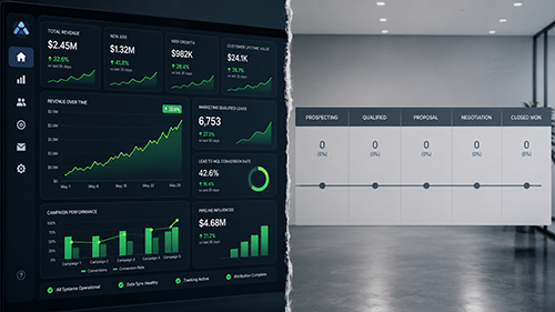

In March 2026, one of our B2B SaaS clients sent me a screenshot of their marketing dashboard with a note on it that said “best month yet.” Sessions were up, social impressions were up, the content calendar was fully shipped, and their head of growth was happy. The problem was that their sales pipeline had not moved in nine weeks, and nobody on the marketing side had caught it, because every metric they tracked was a metric that climbs on its own the moment you publish more.
That mismatch kicked off a six week measurement rebuild across 9 client campaigns, run over 6 weeks of instrumentation work. What we found was not a traffic problem and not a content problem. It was a measurement problem, and it was hiding in plain sight on a dashboard everyone trusted. We had spent months reporting motion and almost no time reporting money, and the two had quietly come apart. Part of the fix was a new measurement layer, including the way we now track share of AI citations as a leading pipeline signal, which replaced three of the vanity tiles on that client’s old report.
The Gap Was That We Measured Motion, Not Money
When we pulled the client’s HubSpot pipeline next to their marketing dashboard, the disconnect was obvious. The dashboard tracked sessions, impressions, follower count, and content output. The pipeline tracked qualified opportunities, and that line was flat at roughly 14 new opportunities per month for the full quarter while sessions had climbed steadily.
The reason was structural. Sessions, impressions, and post count all share one property: they go up whenever you do more work, whether or not that work reaches a buyer. They are activity metrics dressed up as outcome metrics. A team can hit every one of them, feel productive, and still be invisible to the 312 buyers who actually visited a decision page that quarter. At rollout of the old dashboard, nobody had asked which tiles a buyer could move and which ones only the marketing team could move. That was the gap.
What We Rebuilt Over Six Weeks
We stripped the dashboard down to four tiles that a buyer, not the marketing team, has to move. First, qualified opportunities sourced from each channel, pulled straight from HubSpot deal stages rather than from form-fill counts. Second, decision-page reach, meaning visits to pricing, comparison, and documentation pages, which we instrumented in Segment so we could separate buyers researching a purchase from readers skimming a blog. Third, assisted-conversion paths, so a channel got credit when it touched a deal even if it was not the last click. Fourth, an answer-engine citation count, because a growing share of our clients’ buyers now ask an AI assistant for a shortlist before they ever load a website.
The instrumentation took most of the six weeks. Segment events had to be re-mapped because the prior setup fired a “conversion” on newsletter signups, which inflated the conversion rate while telling us nothing about revenue. We rebuilt the event taxonomy, validated it against 312 known deals in Mixpanel, and only then turned the new tiles on for the client.
The Number That Finally Told The Truth
Once the four-tile view was live, the picture inverted. The channel the old dashboard had crowned as the winner, organic social, had driven the most sessions and almost no qualified opportunities. It touched 4 of the quarter’s 47 closed-won deals. The channel the old dashboard barely showed, long-form comparison content that buyers found through search and through AI assistants, had touched 31 of those 47 deals. We had been congratulating the wrong channel for an entire quarter.
In retrospect, the most useful single metric was decision-page reach. It moved before pipeline moved, usually by about three weeks, which meant it worked as an early-warning signal. When decision-page reach started climbing in week four of the rebuild, we could tell the client that pipeline would follow, and it did. Qualified opportunities went from 14 in the slowest month to 27 over the following six weeks, sourced overwhelmingly from the comparison content the old report had ignored.
Three Rules We Now Apply To Every New Account
We underestimated, before this, how easily a good-looking dashboard can hide a flat business. So we standardized three checks at the start of every engagement.
First, every reporting tile has to pass a one-question test: can a buyer move this number, or only the marketing team? If only the marketing team can move it, it belongs in an internal operations view, not in the report the client uses to make budget decisions. Impressions and post count are operations metrics. Qualified opportunities and decision-page reach are outcome metrics.
Second, we map every channel to a deal, not to a click. A channel that drives traffic but never touches a closed deal is a candidate for a budget cut, no matter how good its surface numbers look. We use HubSpot’s attribution alongside a manual deal review, because no automated model catches every assist, and the manual pass over 47 deals took one afternoon and changed the entire budget split.
Third, we measure how often buyers reach the brand through an AI assistant, because that surface is now upstream of the website for a real and growing slice of B2B research. A brand that gets cited in those answers shows up on shortlists it never sees in its referral logs.
The Lesson
The uncomfortable part of this story is that the client was not doing anything lazy. They were shipping more content, posting more often, and watching their numbers go up. The dashboard rewarded all of it. The trap was that the dashboard measured effort, and effort and revenue had drifted apart without anyone deciding that they should.
If you run marketing for a business and your report is mostly green while your pipeline is mostly flat, the first thing to audit is not the campaigns. It is the dashboard. Sort every tile into two piles, the ones a buyer can move and the ones only your team can move, and rebuild the report around the first pile. The work is unglamorous and it takes a few weeks, but it is the difference between knowing your marketing is working and only feeling like it is.
